Page 2 of 2 FirstFirst 12
Results 11 to 19 of 19

Thread: Some graphics choices

  1. #11
    Join Date
    Feb 2005
    Location
    Phoenix, AZ
    Posts
    1,736

    Suggestions

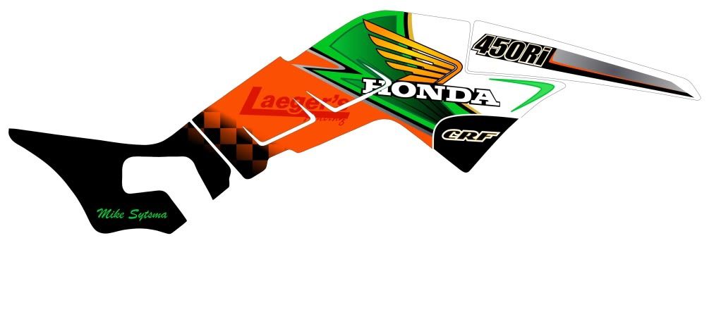
    The suggestions are good. These aren't put up in any order, but if you saw the progression you would see we started with more and have slowly pulled some color out.. My personal favorite is the third, but I think now after seeing the photoshop.. thanks by the way, it helps alot! I don't think it should fade towards the back. I really started this with no idea's in my head, I think its evolving well.
    Fuel Injected Laegers CRF450 passed on....

  2. #12
    Join Date
    Apr 2010
    Location
    wisconsin
    Posts
    1,194
    [QUOTE]Originally posted by SilverLake250R
    [B]I agree. Either replace the red with gold or the blue with gold and take the sticker off the shrouds.

    Or, maybe add a little red somewhere in the chassis to blend it. I actually like the third decal (first photoshop one) with less going on.

    I was thinking replace red with gold then add some kinda of strip/ carbon look to the sections behind the kick start indent so the fade doesnt look as extreme.

    I'm liking the way the small amount of gold in the graphic is still able to show
    Eli Stigler #23
    mx quad 07 trx 450
    tt quad roll design crf tt chassis

    '|^^^^^^^^^^^| ||
    |...BEER TRUCK......| ||'|";, ___.
    |_..._...________=|=||'_|__|.,] -
    "(@)'(@)'"**|(@)(@)**** ''(@)

  3. #13
    Join Date
    Jul 2004
    Location
    Albertville, Alabama
    Posts
    582
    I think the 3rd one matches the theme the best. Do you have ANY blue at all on the quad? That's my main reason for liking that one the best, the others have too much blue. It's my opinion (and only that...an opinion) that you shouldn't have any colors in your graphics that you don't have some of on the quad somewhere. It just looks out of place to me. That's why I only have blue, black, and silver in my graphics (except the sponsor logos) because those are the colors all my PC is.
    Walsh YZ

    Thanks to Quinn Motorsports, Mike's Bikes and Xplicit Motorsports

  4. #14
    Join Date
    Feb 2005
    Location
    Phoenix, AZ
    Posts
    1,736

    graphics

    250renvy, photoshop these real quick
    Photobucket
    Fuel Injected Laegers CRF450 passed on....

  5. #15
    Join Date
    Feb 2005
    Location
    Northeast
    Posts
    3,101
    Hontrx265r : I like your design, however IMO the gold that you chose for your base dictates your overall graphic choice. You can do something like you have and that's your choice, but to me the subdued gold needs to be reflected in the overall graphic.

    Attached is yours: It looks good, but just doesn't look quite natural.
    Attached Images Attached Images

  6. #16
    Join Date
    Feb 2005
    Location
    Northeast
    Posts
    3,101
    I know it doesn't pop like your colors but it looks more like it belongs - to me, but it's your quad. You wouldn't have to use this, it's just an idea.
    Attached Images Attached Images

  7. #17
    Join Date
    Feb 2005
    Location
    Phoenix, AZ
    Posts
    1,736

    colors

    I understand where your coming from, but there are subtle ties in the graphic to the gold, Something that you don't really pick up when you photoshop, but I think its enough to pull it together. What you did imo over powers it. Thats what your conditioned to because in the past graphics have always been very standard like that. Have to go out on edge a little to be different. I think this color scheme looks awesome.
    Fuel Injected Laegers CRF450 passed on....

  8. #18
    Join Date
    Feb 2005
    Location
    Phoenix, AZ
    Posts
    1,736

    colors

    Photobucket
    Fuel Injected Laegers CRF450 passed on....

  9. #19
    Join Date
    Apr 2007
    Location
    Little Apple
    Posts
    3,380

    Re: colors

    Originally posted by hontrx265r
    I understand where your coming from, but there are subtle ties in the graphic to the gold, Something that you don't really pick up when you photoshop, but I think its enough to pull it together. What you did imo over powers it. Thats what your conditioned to because in the past graphics have always been very standard like that. Have to go out on edge a little to be different. I think this color scheme looks awesome.
    I agree 110%... there is small hints of gold in those graphics that tie the frame into it. I like the black on the rear portion too.
    496cc Saber 2 Stroke MX Project "Elsinore" (Laeger Narrow/CR500 Build - In Process)
    89 TRX 250R - Fully Restored Original

Page 2 of 2 FirstFirst 12

Posting Permissions

  • You may not post new threads
  • You may not post replies
  • You may not post attachments
  • You may not edit your posts
  •